UTG Academy – Website Redesign
Dec 18, 2019
Programming is a skill that is not easy to acquire. I remember myself eight years ago when I decided to switch my career into programming, it was intimidating at first, and I started without basic programming knowledge. It took me a lot of practice to be proficient in programming.
These days, I see a lot of high demand jobs require to have programming skills. The fact that programming skills are becoming increasingly important, most secondary educations still don't teach programming as a mandatory subject. Luckily, a lot of parents nowadays are becoming more aware of how important it is for their children to harvest their programming skills.
UTG Academy (Under The GUI Academy) was founded to facilitate the programming education demand. Founded in 2013, UTG Academy is a programming school for students from grades 1 to 12.
Project goals
As the academy grew, the need to redesign and reoptimized its website became necessary to help further growth. Some of the key goals of this project were:- Improve finding courses and registration process
- Incorporate the community-related content to their website
- Reduce the redundancy of the content
- Rebrand and redesign the overall website
- Optimized existing content and functionalities
- Create more engaging content for both parents and children
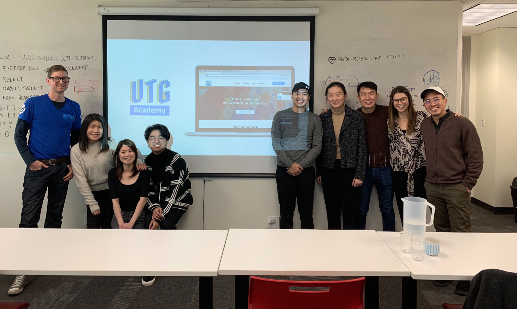
For this project, our team consisted of 4 UX and 2 UI designers. As the project scrum master, my role focused on leading daily scrum meetings, establishing communication between UX and UI teams, making sure the project was on the right track and was involved in all UX design processes.
Research
To learn more about the market, users, problems and opportunities, we conducted a series of qualitative and quantitative research such as domain research, survey, and contextual inquiry.Domain Research
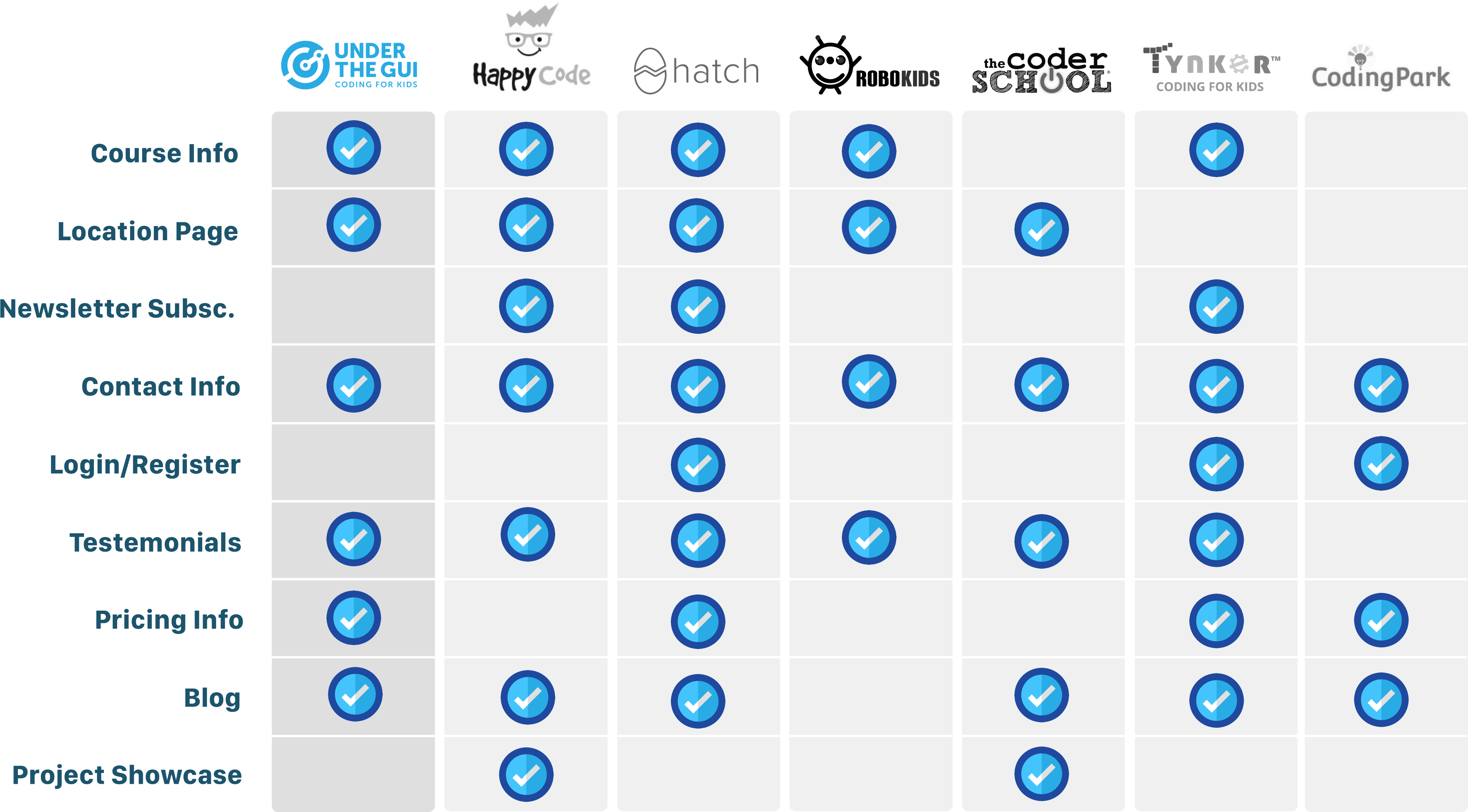
In the research phase, the first thing we did to gain a deeper understanding of how UTG positioned among its competitors, we conducted domain research. Based on our findings from canadalearningcode.ca showed that - 91% of Canadians think children learning coding or computer science is important. In this generation, a lot more parents realize that programming is a very useful skill to have because there's an increasing number of industries that rely on programmers.We also did competitive/comparative analysis on other similar school websites to get to know their direction in terms of functionality and content on their websites. This analysis helped us identify how to best position UTG on their online presence.
Survey
To identify our users and user-motivations, we organized surveys using Google Forms and sent it to parents to fill it out at their own time and convenience. Here are some of the highlights of our findings from all responses we received:Contextual Inquiry
In terms of detecting the users' pain points of the exact steps on their website, the surveys were limited and insufficient. To tackle that, we decided the meet the parents from one of the UTG schools to conduct user-testing on the current website.- Test Scenario 1: Find a class appropriate for your child’s age:
parents were able to find course information, but neither of them did it at the first try. - Test Scenario 2: Contact the child’s instructor for a question:
Neither of them knew about the “Forum” feature that allows parents to ask instructors questions. In fact, one parent thought he had to go on the “Contact” page and fill out a form.
We also found most parents were confused in differentiating parts of the website for instructors, parents, and franchises. Another example, it took too many steps to find price info from the homepage.
Affinity Diagram
After we collected all the data from our research we created an affinity diagram. We wrote key findings on sticky notes and grouped them into relevant categories. An affinity diagram also helped us in creating a user persona and feature scope.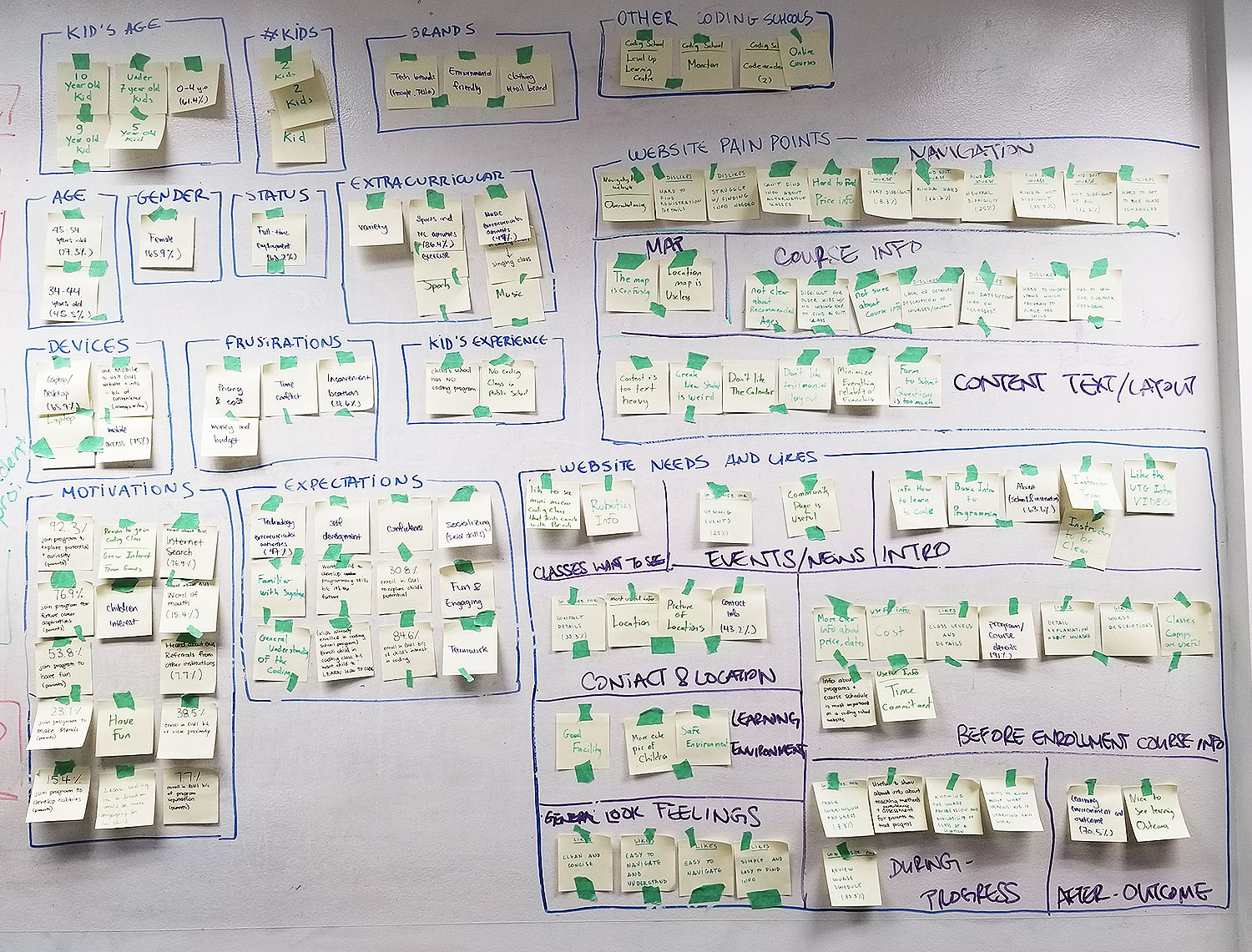
From our affinity diagram, we found some of the pain points that we could improve on, such as finding course information and location, reducing text-heavy content, and a fully responsive layout as our survey data showed that most existing users were mobile users. We also found that parents liked the current instructor's information section, but we found that additional information about the learning environment for each location would add value to this.
User Persona
After we finished creating an affinity diagram we created a user persona based on user pain points and goals.Rachel Lee
40, Married, Senior Accountant"Ben is very curious and I believe coding helps him to achieve his full potential."Rachel is a Senior Accountant and mother of Ben, a 8-year old boy. She and her family recently moved to Vancouver. Currently, Ben is taking swimming and violin lessons, but Rachel is starting to look into coding classes for Ben. Ever since Ben started learning coding skills in his past school and also through Minecraft, he’s been very passionate and excited about playing the games he creates. Since Ben’s current public school does not teach coding for kids his age, Rachel is looking into coding classes for him outside of school.
- Hard to find the right course for her child
- Hard to find price info
- Finds content and layout of the website overwhelming and confusing
- Scheduling conflicts with other extracurricular activities
- To find a safe and fun, learning environment for Ben, with successful student outcomes.
- To be easy to navigate and find information about instructors and program details.
- To support the child’s development, creativity and social skills.
Planning
After we finished our research and have a user persona on hand, we began planning our design solution. In this phase, we created a journey map, priority matrix, user-flows and sitemap.Journey Map
We made a journey map based on Rachel Lee's persona. Aside from helping us to map out user's thoughts, experience, and pain points towards the UTG website, it also helped us to pinpoint which stages in the user experience can be improved.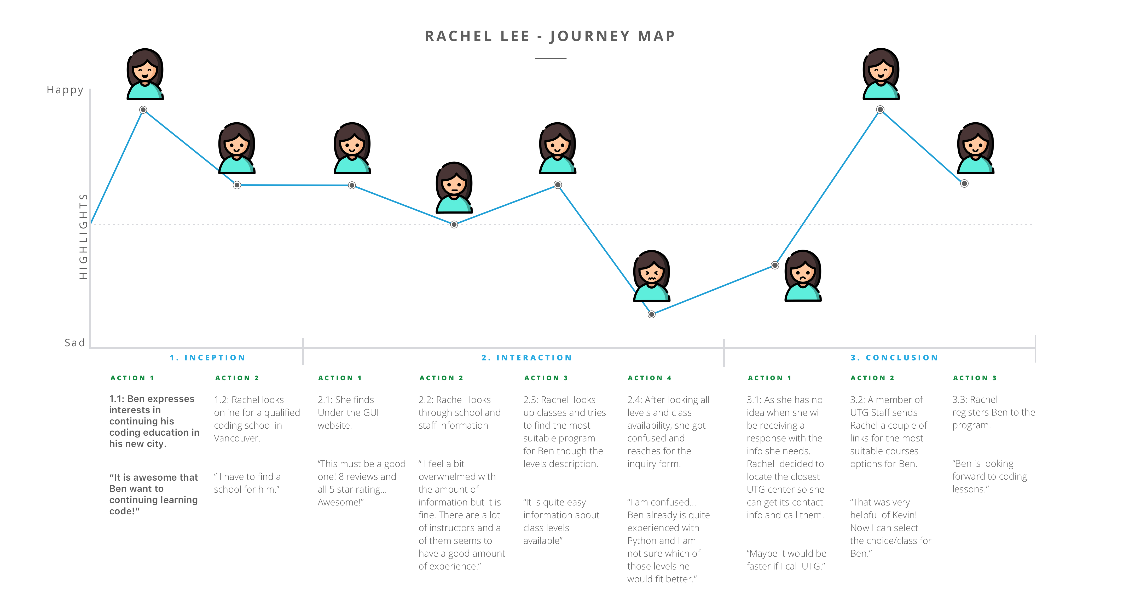
Features Priority & MVP
Based on the user journey and persona we created, we listed all the potential features and prioritized them based on high to low user value and effort metrics. After considering the time constraint and resources we had, we decided to narrow down our scope for our MVP (minimum viable product).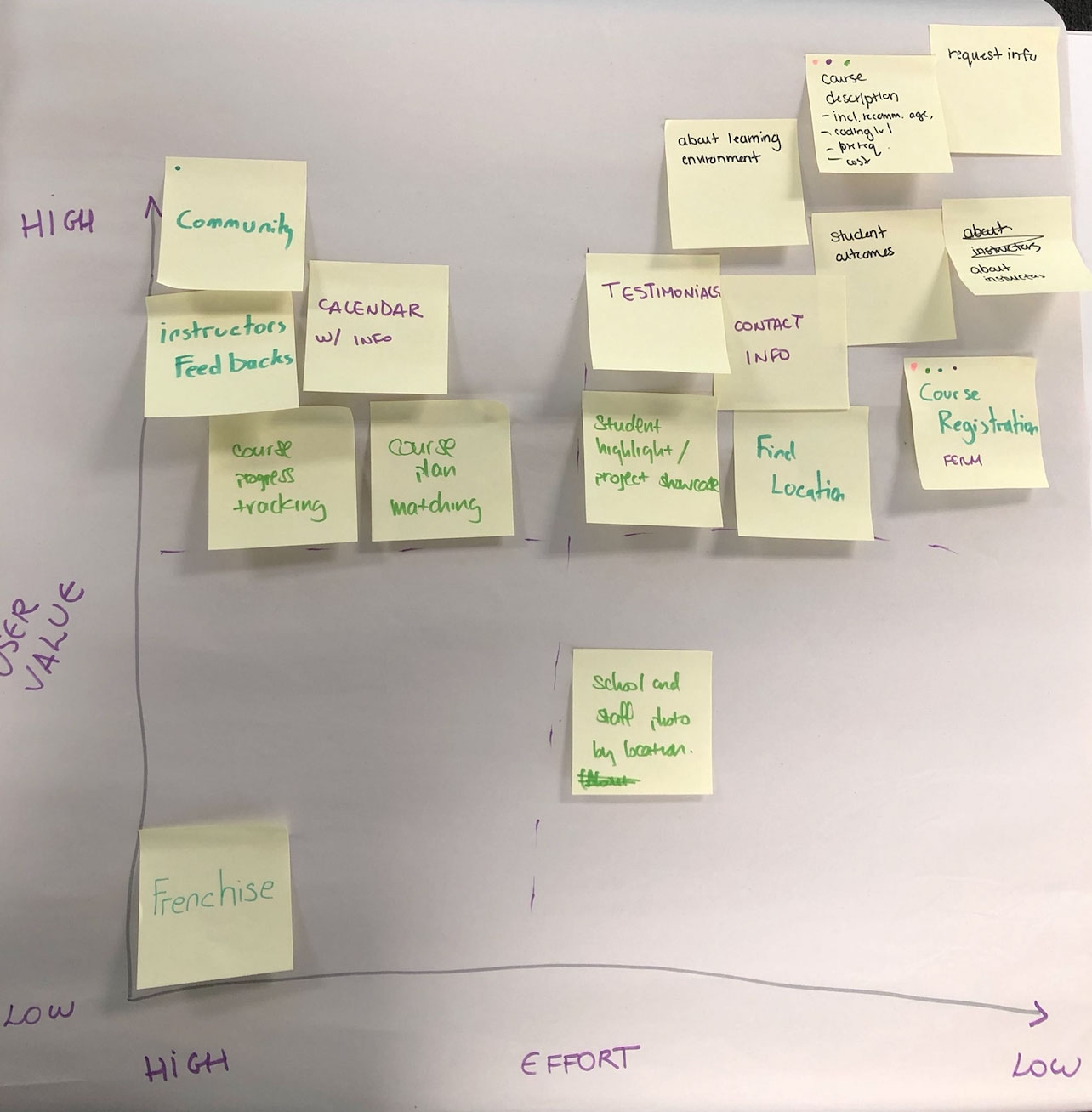
On our MVP we divided each feature into three different buckets: must-have, nice to have, and not needed. We ended up taking all the list of must-have and some nice-to-have buckets into our project scope. Because of the time constraint, we didn't take calendar and intranet for student login.
 MVP features for UTG website
User-flows
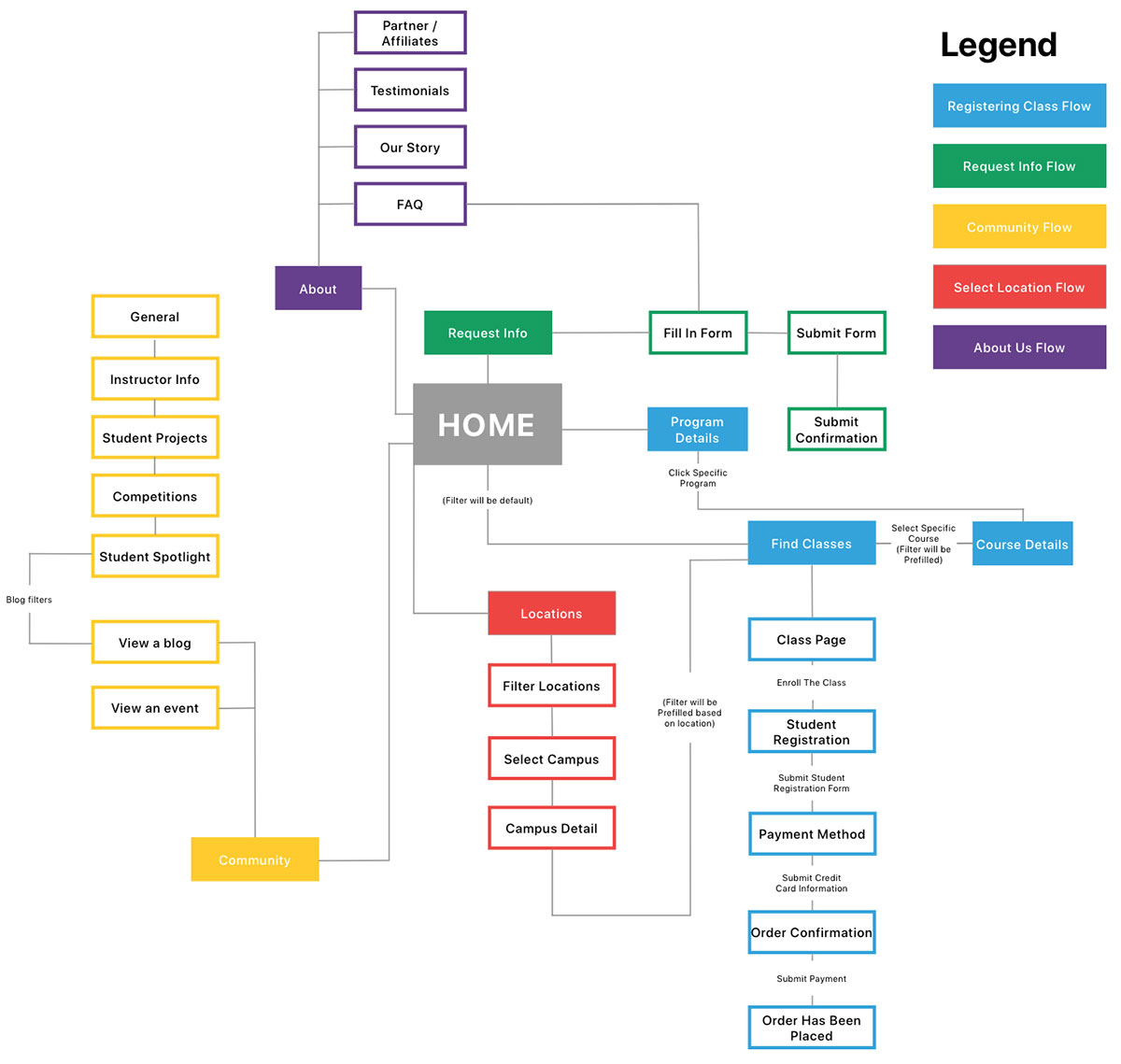
Next, after we did the MVP and were equipped with a better understanding of the whole scope of the project, we designed our user-flows.During the user-flow creation process, the most challenging part was to create a user-flow that could help parents find suitable courses based on their time availability and location. What we found was that the locations page can be linked to the find course page, thus parents could find classes based on location. This is based on the result from our user testing that showed some parents prefer to find classes closest to where they live.
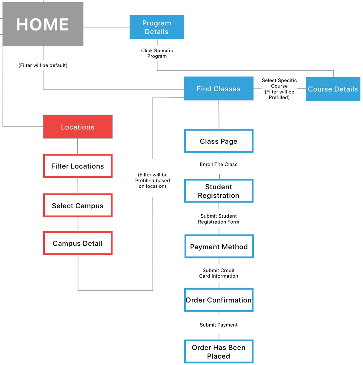
Therefore, we decided to create five different user-flows: registering class, request info, community, finding locations, and about us.
Design
Low-fi
We started our design process by creating low-fi prototypes and test them out ourselves to make sure our flows didn’t miss any steps and had all the required information.We found testing our own low-fi prototypes first were very helpful because it allowed us to make necessary revisions before creating proper user scenarios.
After testing was completed and we had revised our own low-fi prototypes, we tested the prototypes on other users. The reason we conducted the test with other users outside our team was to minimize biased opinions about our solution.
Mid-fi
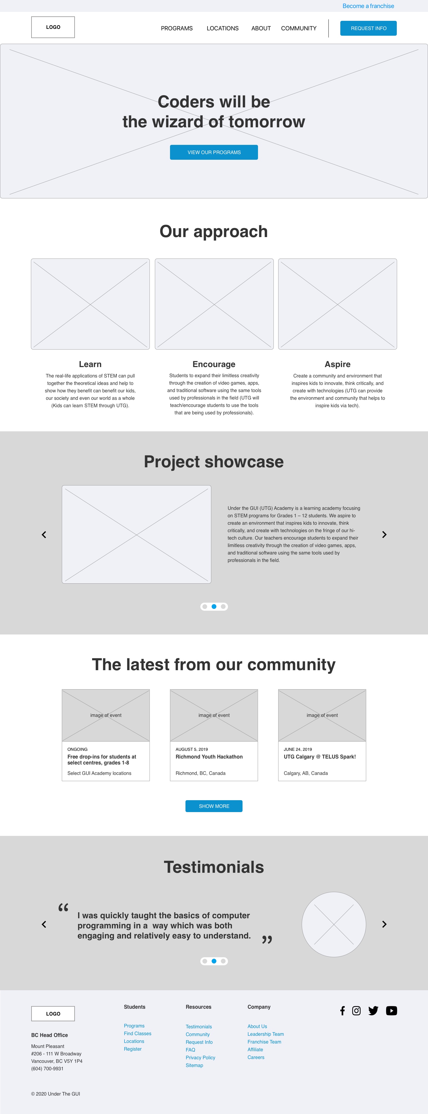
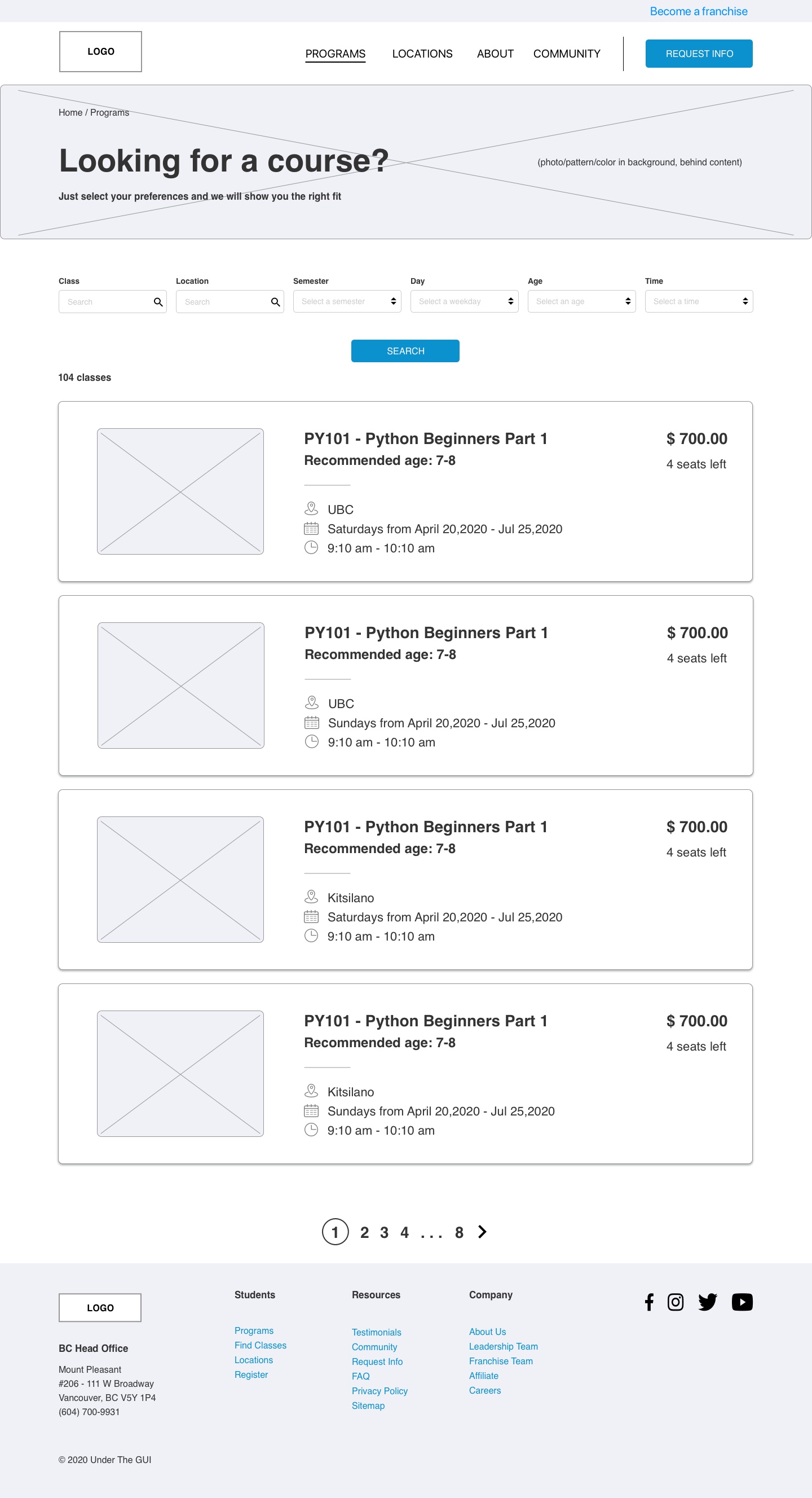
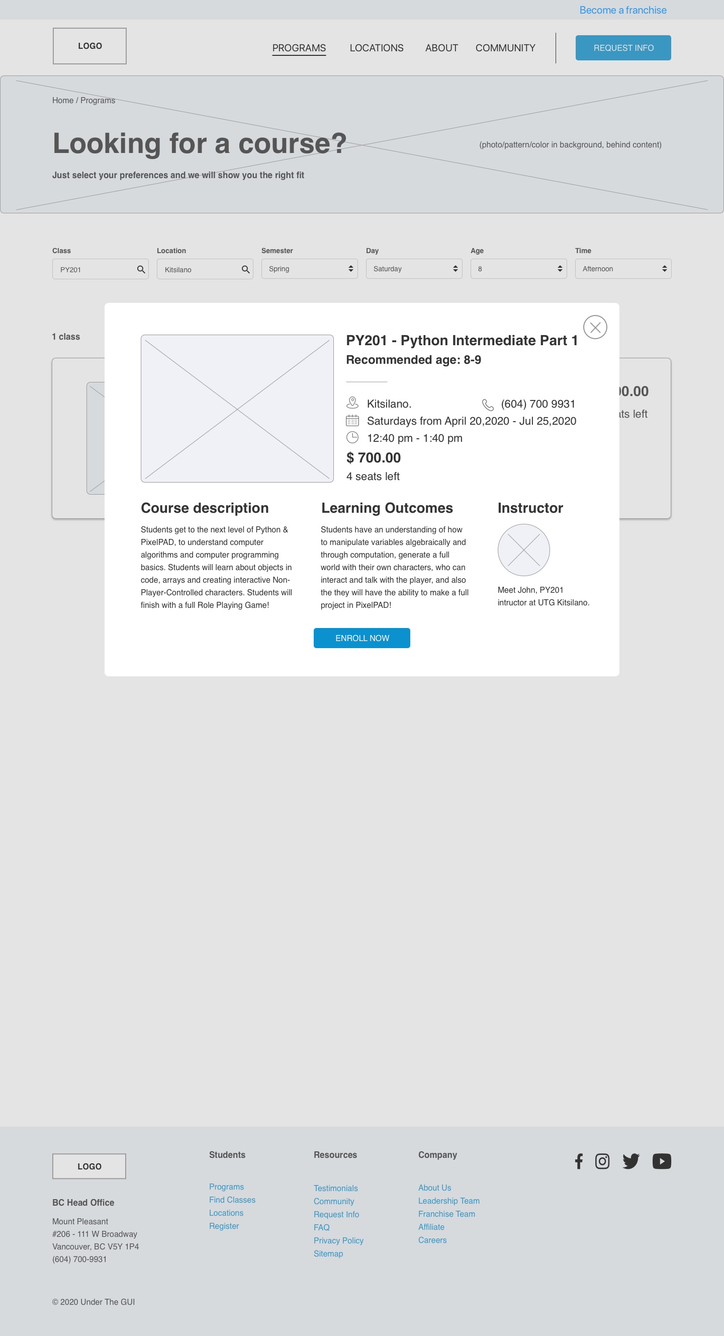
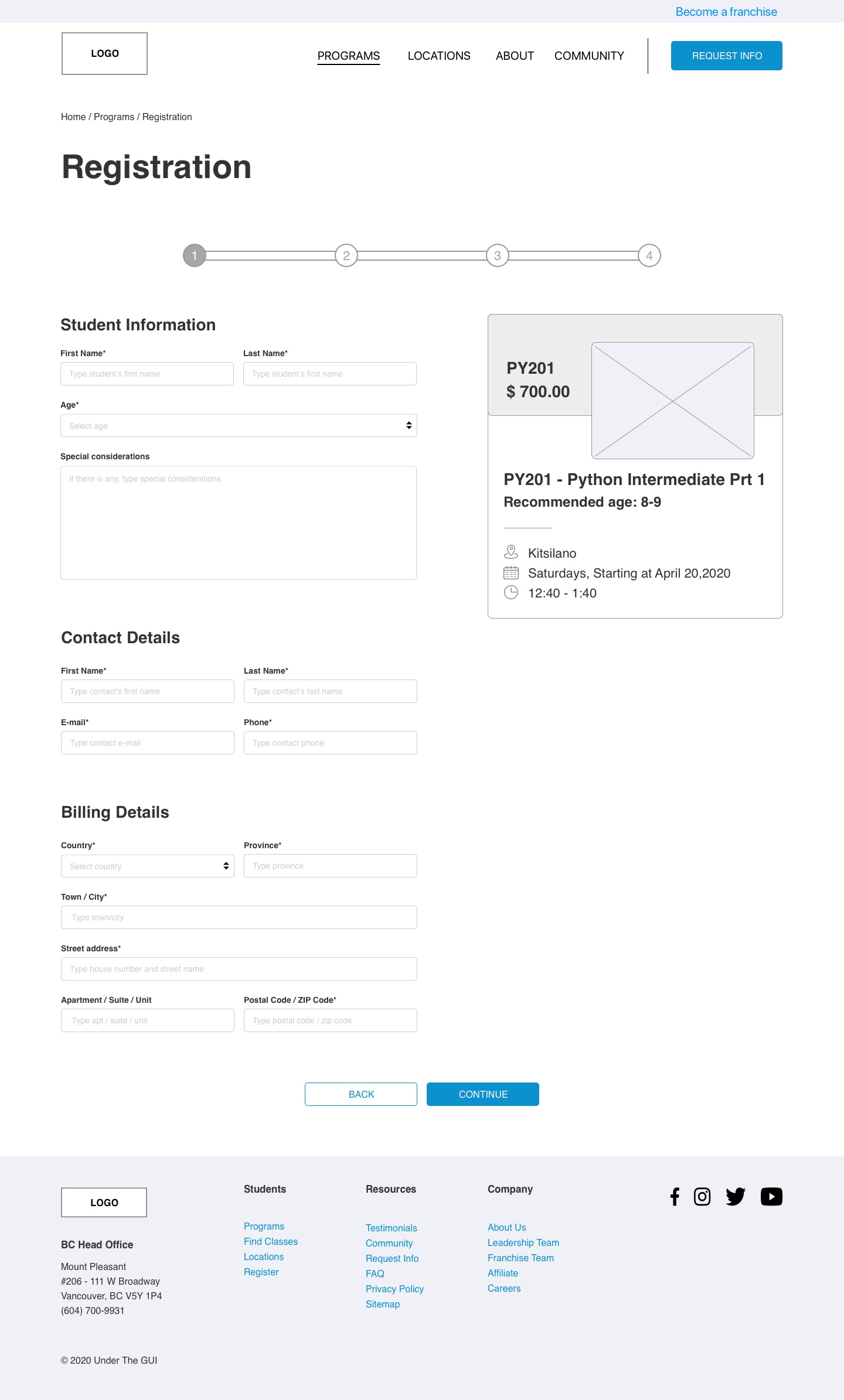
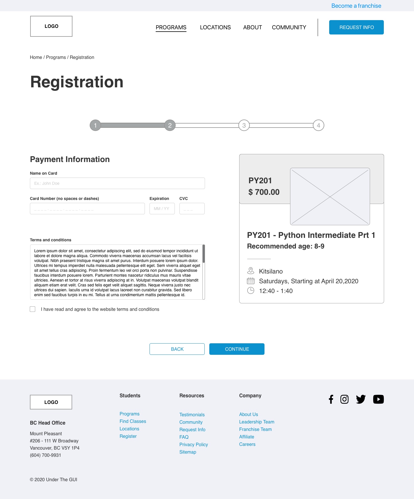
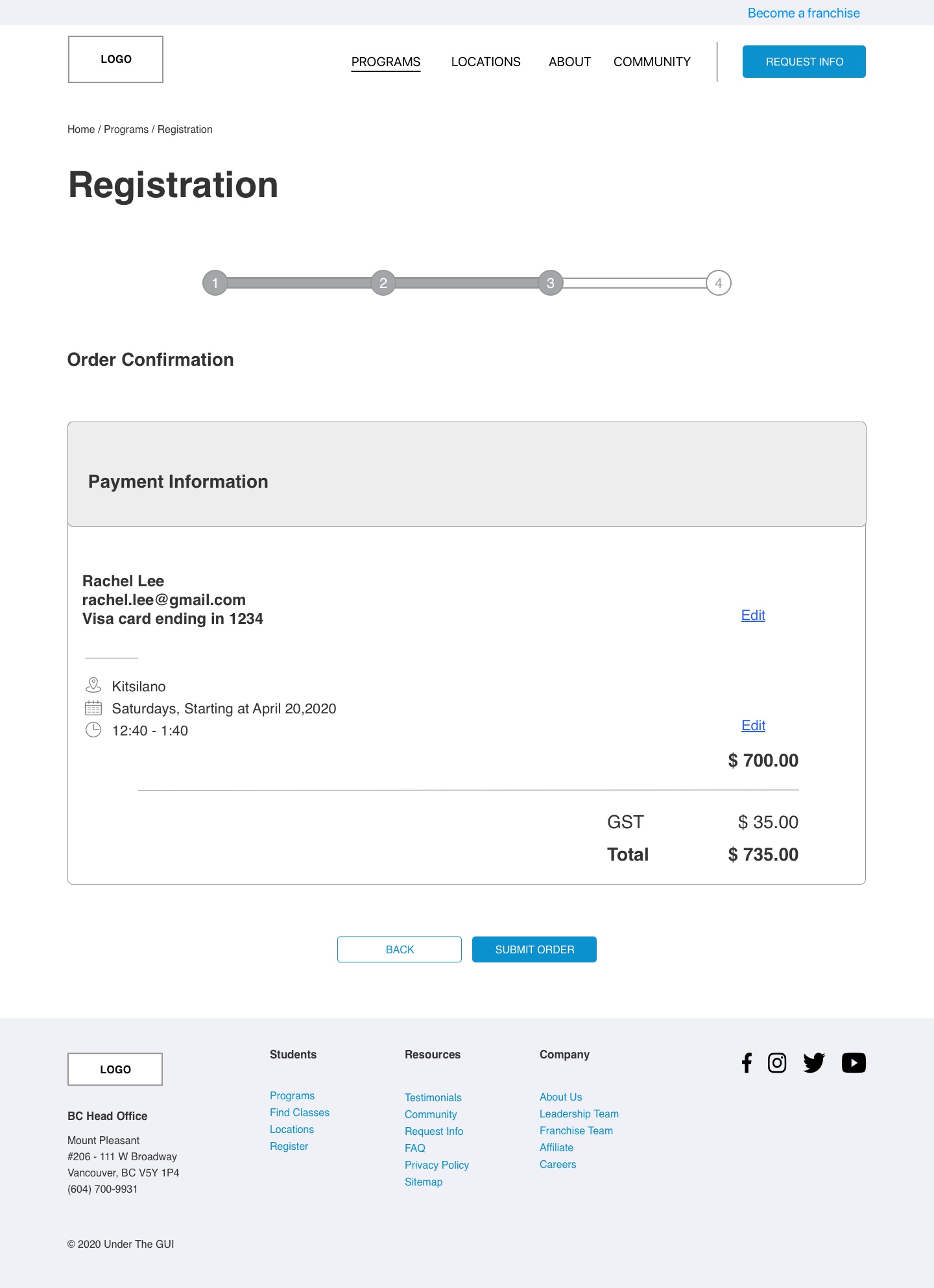
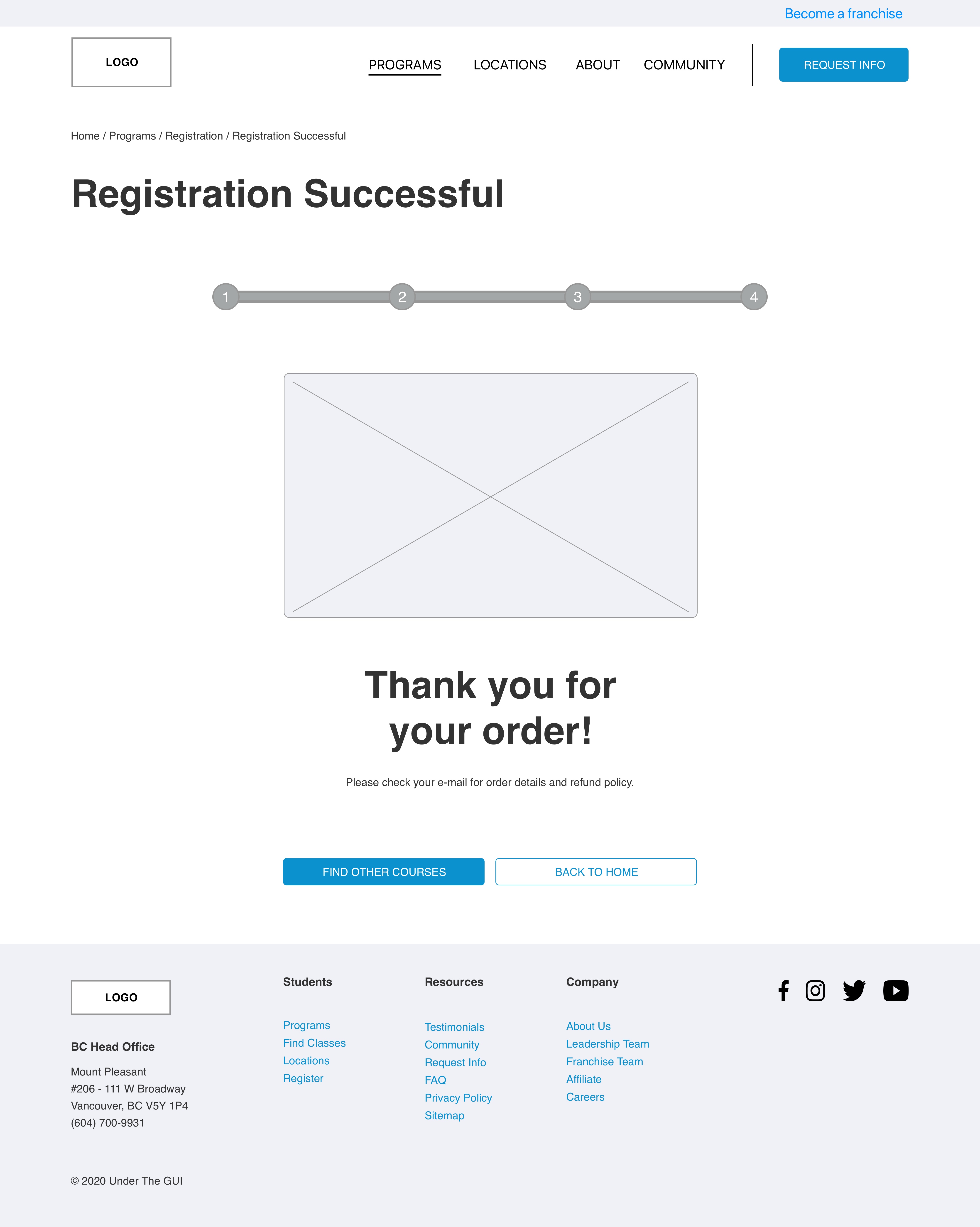
Our mid-fi was the last tangible deliverable from the ux team before we hand it over to the UI team to build the hi-fi prototypes. During this creation process, it was important for us to establish a core library UI component to ensure the style consistency throughout all of mid-fi prototypes, and to provide an easier transition for the UI team to skin all of our mid-fi pages.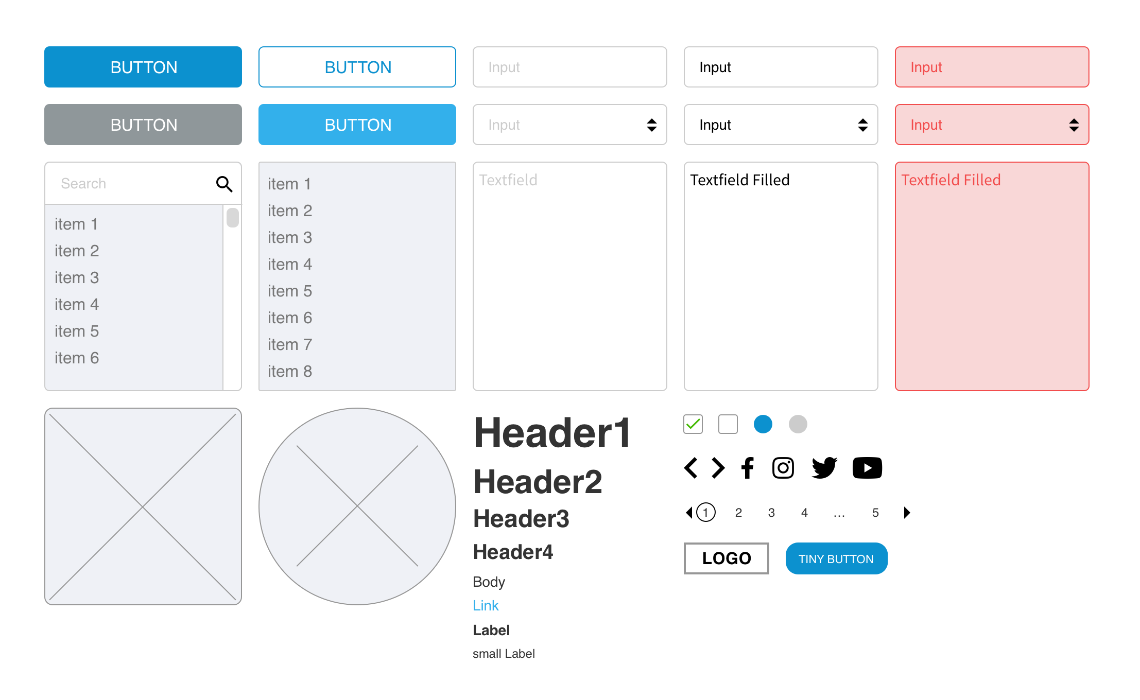
Following the same process like as we did for low-fi, we tested our mid-fi on other users to make sure our flow made sense to the users and it also gave us a chance to make minor adjustments before proceeding with the high-fi prototypes.



Hi-fi
Once mid-fi prototypes were finalized, we conducted a run-through to ensure both UI and UX teams were on the same page on the direction of the final high-fi prototypes.For the UI approach, we derived inspiration from Minecraft and Mario Bros games because the age demographic of most millennial parents and Generation-Z children are very familiar with these games. To us, Minecraft was the definition of playful, fun, kid-friendly, and creative which is very suitable for what UTG stands for.
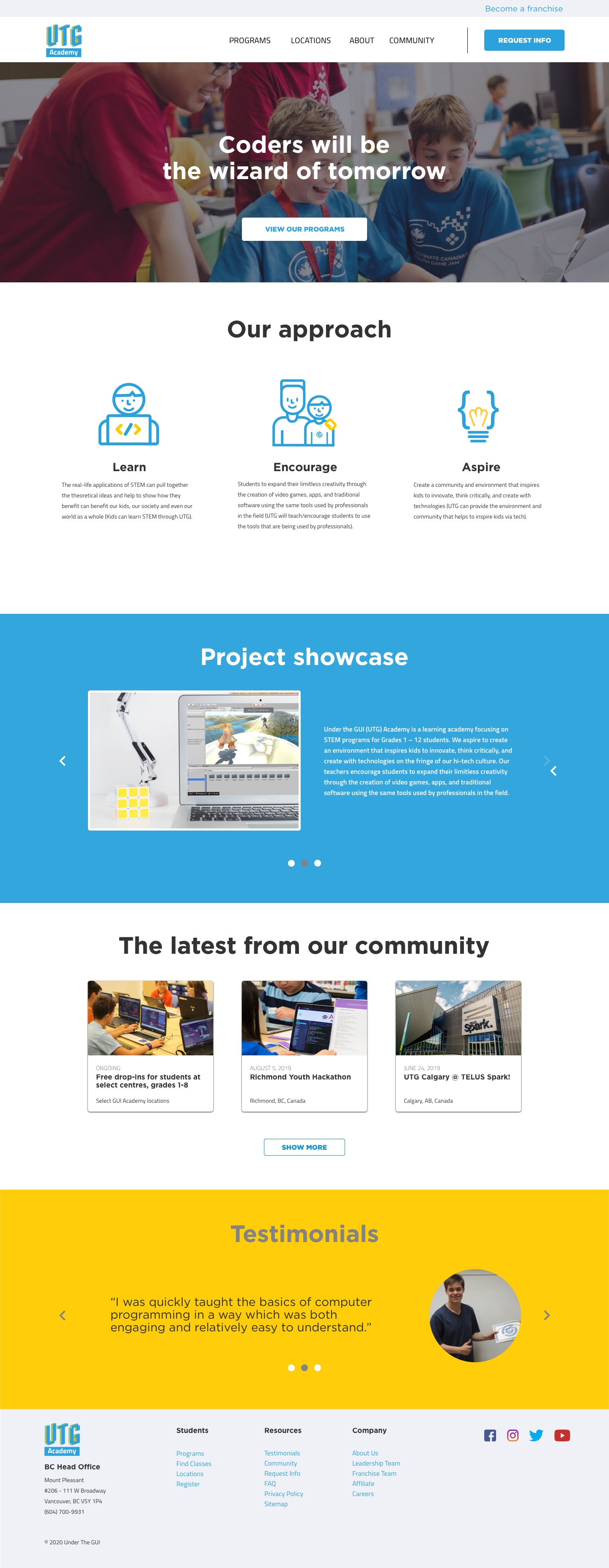
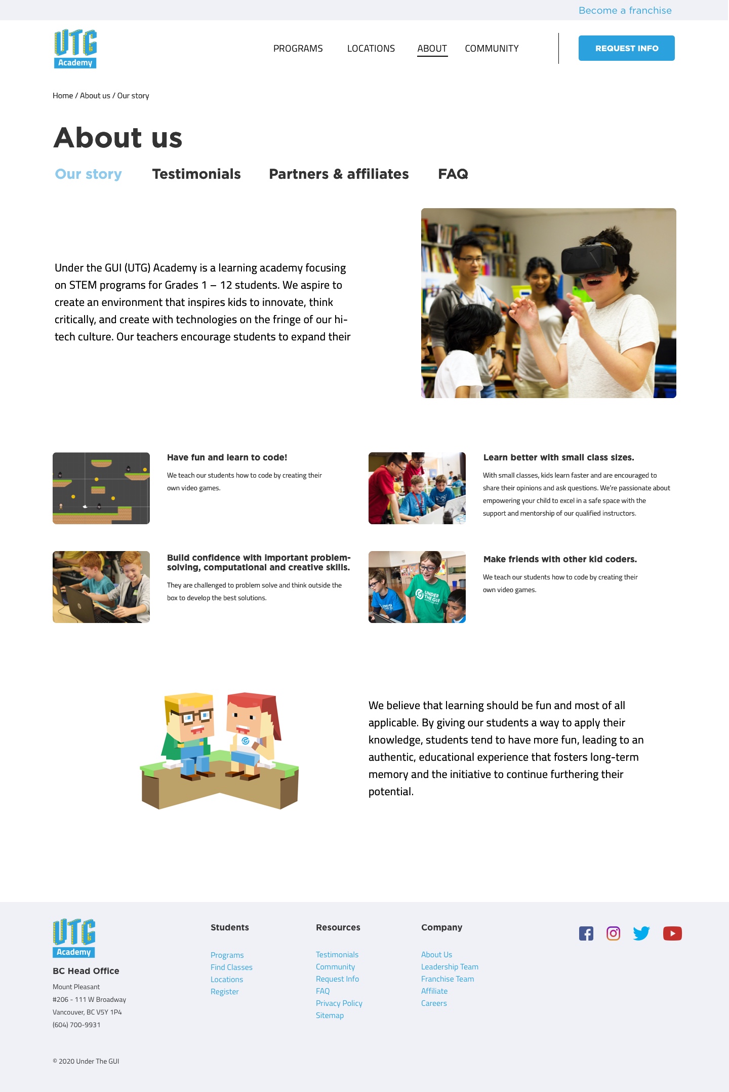
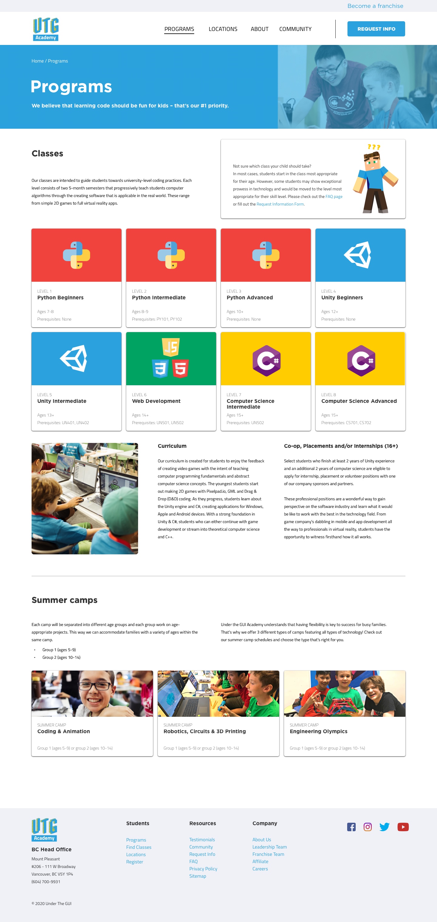
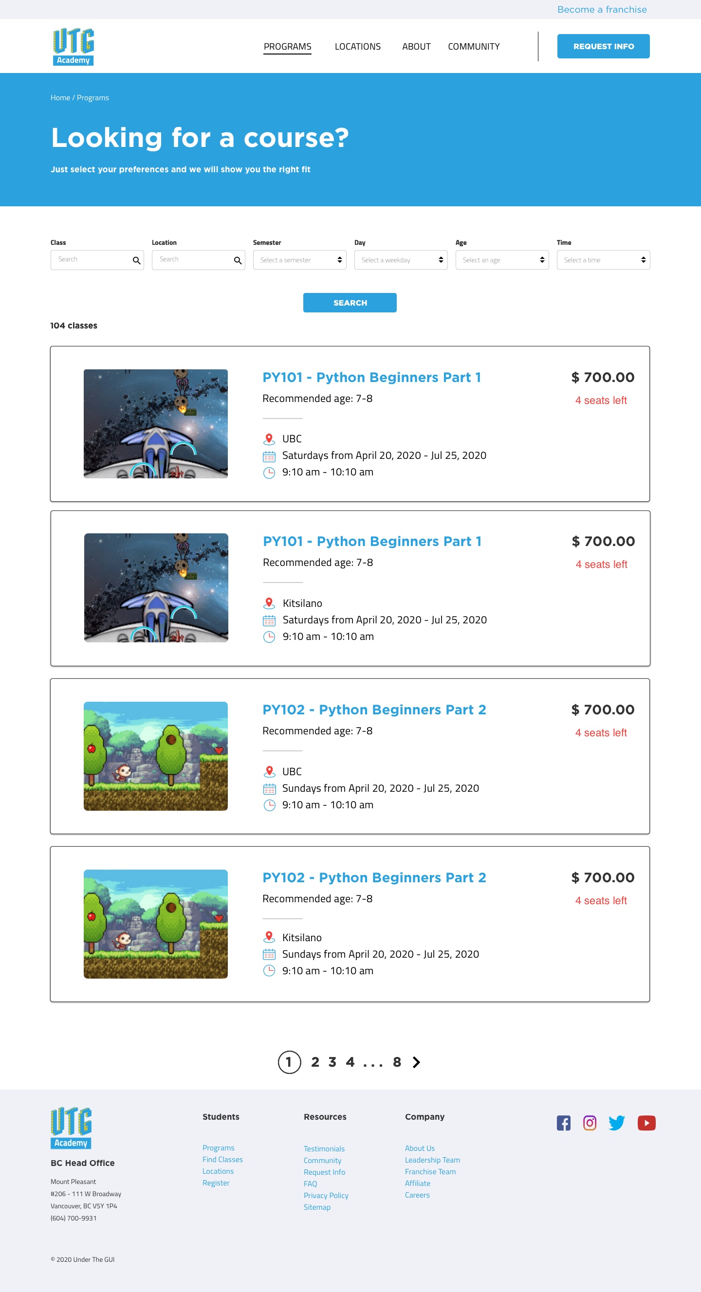
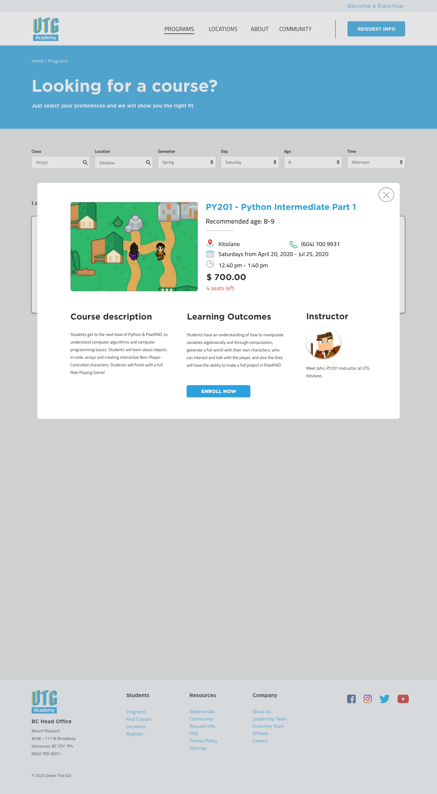
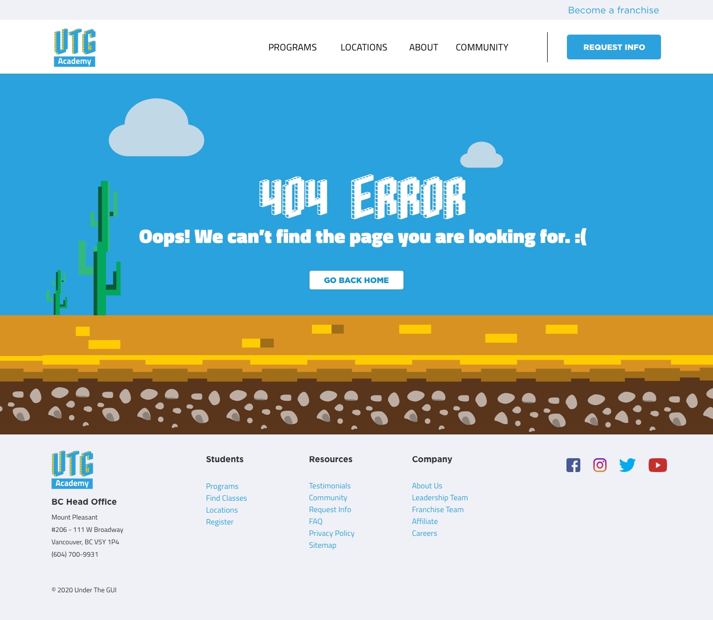
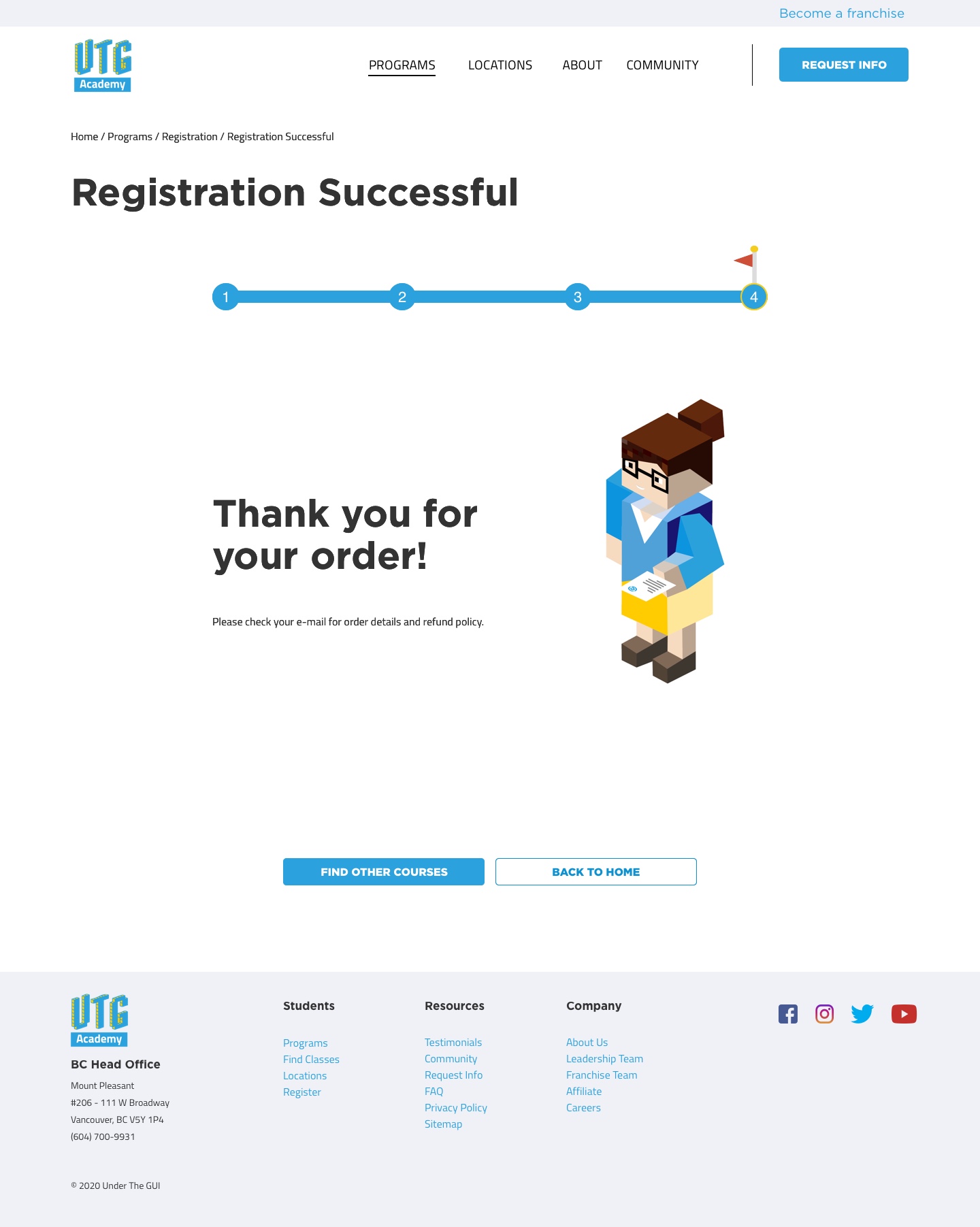
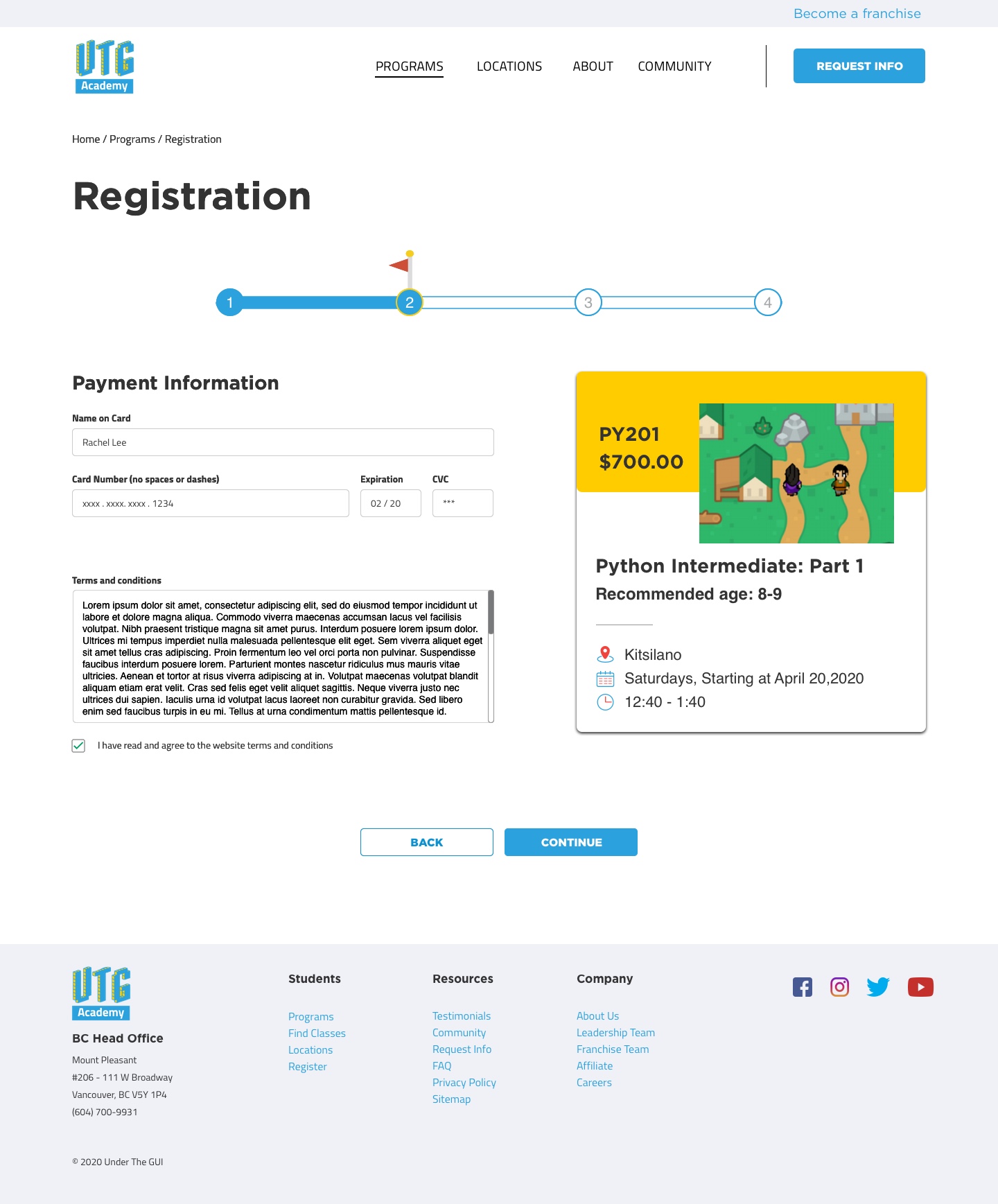
We incorporated gamification for some of our pages, for example, the images on our 404 and registration pages are inspired by old Mario Bros game in the early 80s. The purpose of this approach was to add a hint of creativity and fun factor to the website.
Future Considerations
Because we had to finish this project in less than 3 weeks, we could only finish our MVP features. However, given more time we believe the website can still be improved. One of the features that we felt could greatly help both students and parents would be to incorporate a student login portal.With this portal, it will open up other important features such as course wishlist, better registration process, student progress tracker, and online one-on-one feedback from instructors.